
How to Tell If a Painting Is Good (Even If You’ve Never Heard of the Artist)
Six ways of looking before you read the label, tested on a Manet and a painting by the student history forgot.
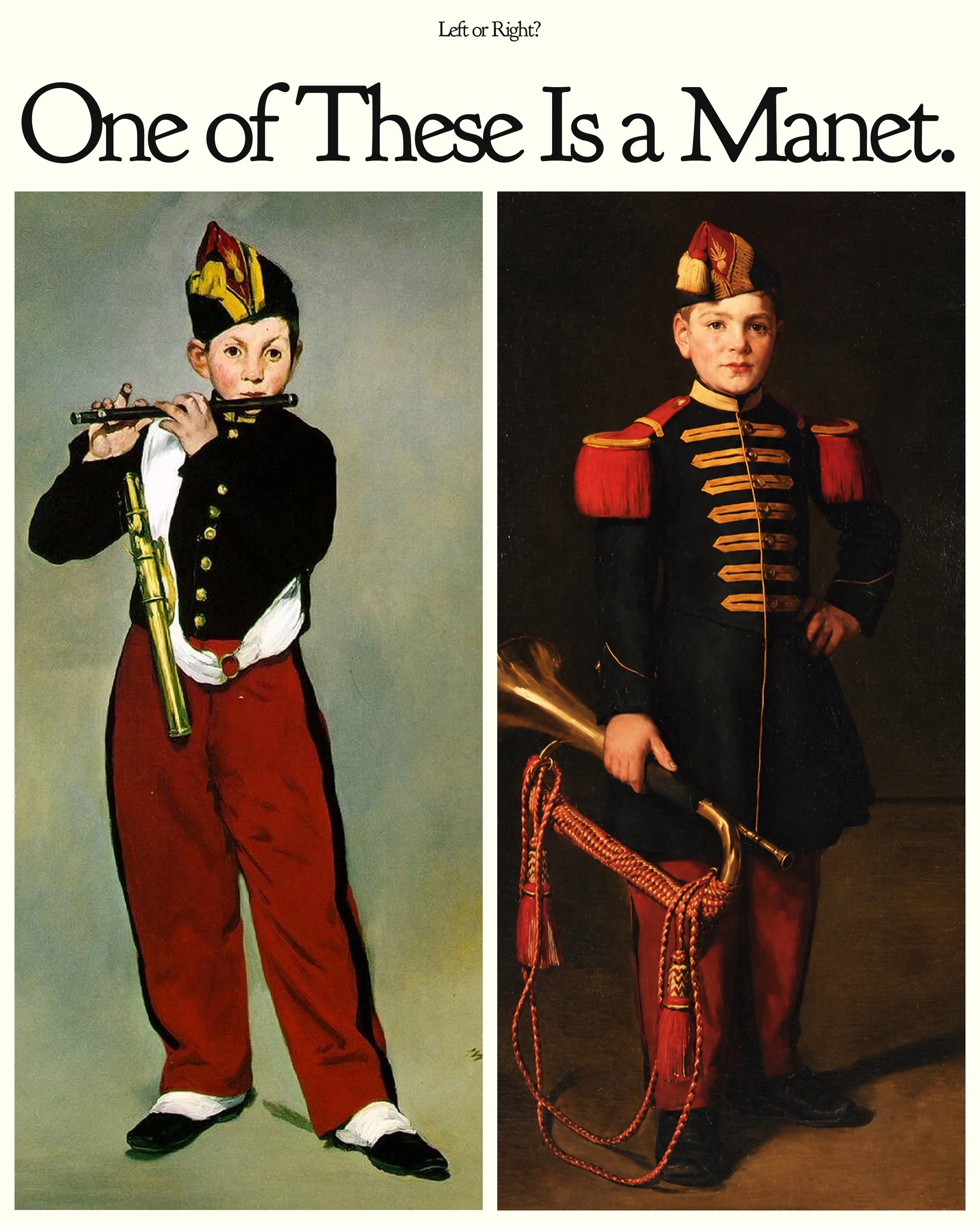
One of the two paintings above is by Édouard Manet, one of the most famous painters of the nineteenth century. The other was painted a few years later by his only student, a painter most people have never heard of. Before you read on, decide which is which. Hold on to your answer, because it comes back at the end.
Most of us never get to make that choice blind. In a museum, the label tells us whose work we are looking at before our eyes have done anything. In a gallery, the name sets the price, and the price tells us how impressed to be. So when we stand in front of a painting by an artist we don’t know, two questions arrive almost at once: is this any good, and am I allowed to like it?
There is no formula that answers the first question for everyone, and there shouldn’t be. Taste is personal, and the paintings that move one person can leave another cold. What you can learn is how to look, so that your own judgement rests on something more than a name. That is what learning how to tell if a painting is good really means. The answer to the second question is simpler. Yes, you are.
Why we judge the name before the painting
The student in our test spent her whole career showing how much a name can get in the way.
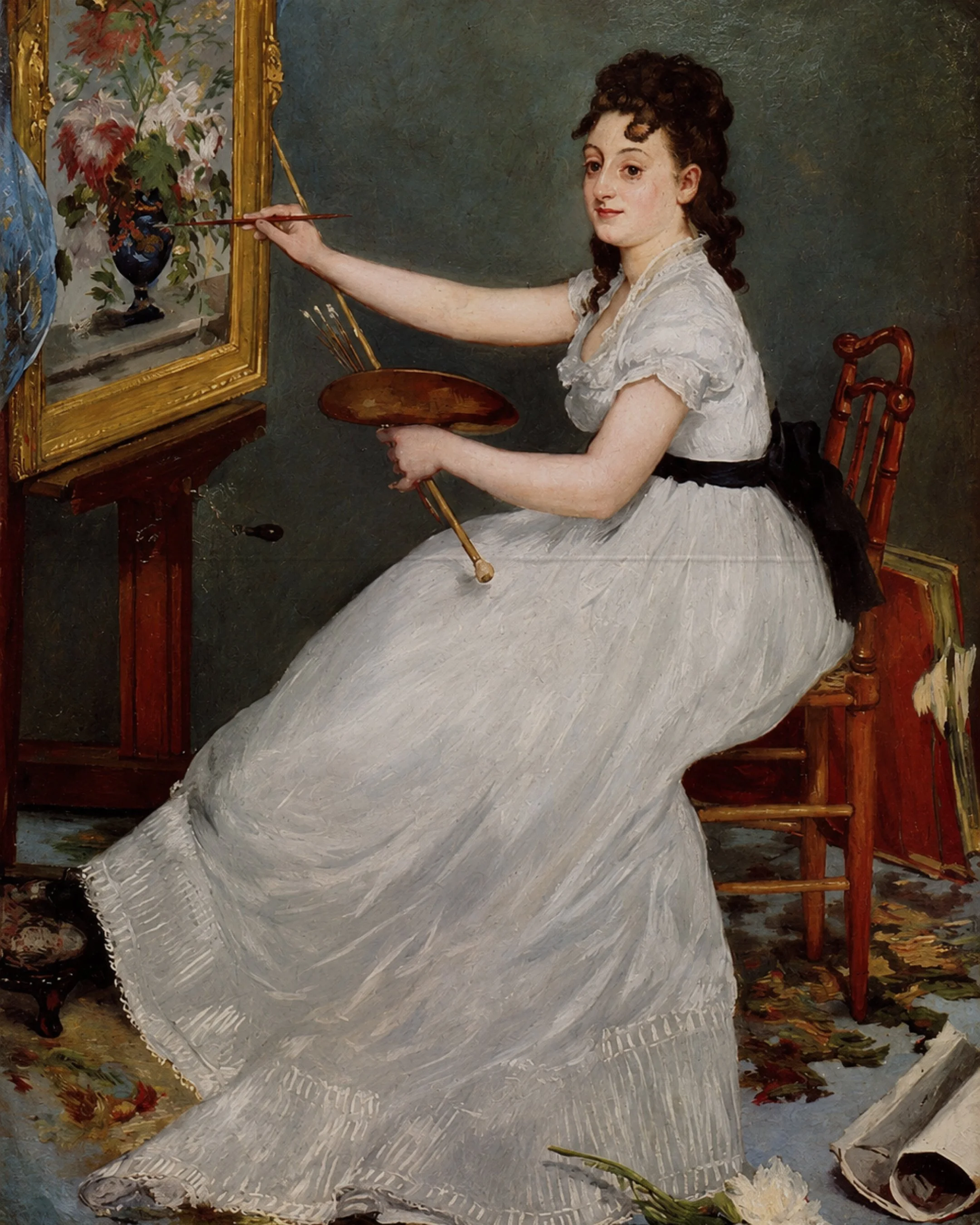
Eva Gonzalès became Manet’s only formal pupil in 1869. A year later he exhibited his portrait of her at the Salon, and from then on she was introduced as his student first and a painter second. Even at her memorial retrospective in Paris in 1885, critics wrote more about his portrait of her than about her own paintings. She died in 1883, just days after Manet, shortly after giving birth to her son. Most of her paintings stayed with her family, and for decades very few people saw them.
This autumn, the Petit Palais in Paris has given her the first major retrospective of her career, with almost 100 paintings, pastels and prints on show until 24 January 2027, before the exhibition travels to the Van Gogh Museum in Amsterdam. It took more than 140 years for enough people to look at her paintings rather than the name beside hers. You don’t have to wait that long to trust your own eye.
Artistic reputations are rarely shaped by talent alone. The institutions that exhibit an artist, the critics who write about their work, the collectors who support them and the circumstances of their time all influence whose names become familiar. For women artists in the nineteenth century, opportunities for formal training, professional recognition and institutional support were often more limited. Gonzalès’s story reminds us that art history is not simply a record of the best paintings ever made, but also of the artists whose work had the opportunity to be seen, discussed and preserved.
Six things to look at before you read the label
None of these is a test a painting passes or fails. They are questions that slow you down and help you notice what a painter has done, so you can decide for yourself what you think of it. Try them on the two paintings at the top of this page, then on anything you are thinking of hanging at home.
1. Where your eye goes first
Every painting is a set of decisions about where you will look and in what order. Painters call this composition. They steer the eye with contrast, colour, size and direction, and the best way to feel it is simply to notice where your eye lands in the first second, then where it travels next.
In The Fifer, there is almost nowhere to look except the boy. Your eye usually lands on his face, drops down the black jacket, and is carried by the long red trousers to the white spats at his feet. The flute and the brass case at his side add two short diagonals that stop the figure from feeling stiff. In Enfant de troupe, the path is more of a loop. The face draws you in first, then the gold braid across the chest, then the red epaulettes, and finally the bugle and its red cords curling around the bottom of the picture. Neither route is better. One is direct, almost like a poster, and the other invites you to wander.
2. What the painter left out
Every painting is also an edit. What is missing tells you as much about the painter’s intentions as what is there, and empty space is rarely an accident.
Manet removed almost everything around the boy. There is no floor line, no wall and no horizon, only a flat grey ground and a small shadow at the boy’s feet. The painting was strongly shaped by Manet’s admiration for Velázquez. Gonzalès made a different choice. She kept a floor, a dark background and a cast shadow, so her boy stands in a real room with real weight. Manet’s version feels detached from any time or place. Hers feels like a portrait of a particular child on a particular day. Ask yourself which of those effects you respond to, and why.
3. How the light behaves
Light is how a painter turns flat paint into form and mood. Strong light from one side creates deep shadows and drama. Soft, even light flattens shapes and can feel calmer or more modern. You don’t need training to read it, because you have been looking at light every day of your life.
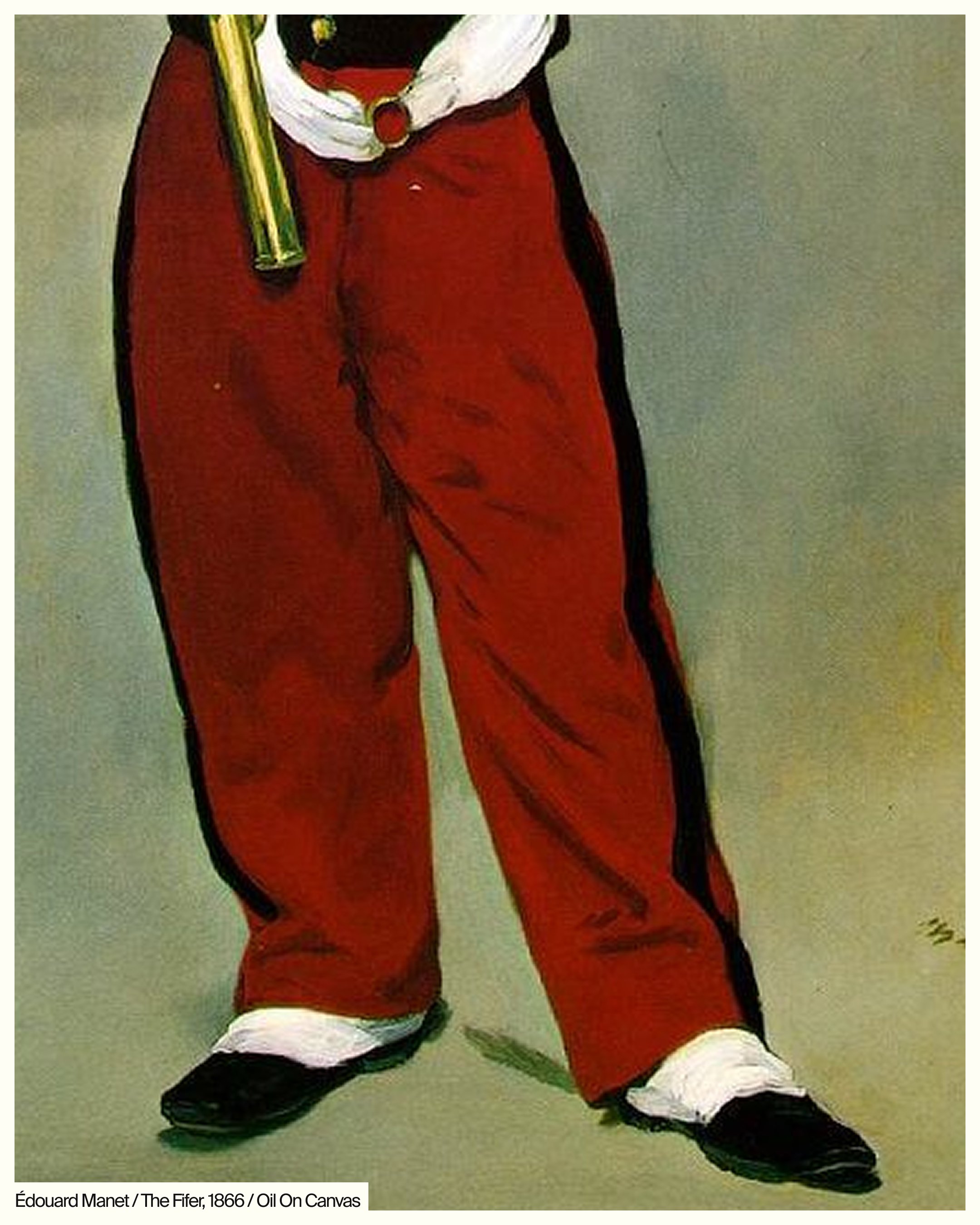
The light in The Fifer is flat and frontal. The red trousers have only a few darker strokes to suggest folds, so the figure reads almost like a cut-out against the grey. Gonzalès lights her boy from one side. The jacket has more modelling (the shading that makes a flat surface look rounded), the face turns gently into shadow and his shadow falls across the floor, which gives him volume and presence. Comparing the two shows how much atmosphere comes from light alone.
4. What the colour is doing
You don’t need colour theory to notice what colour is doing. Look at how many colours there are, whether they feel warm or cool, and whether one colour has a particular job, such as pulling your eye in, balancing a corner or holding the whole picture together.
Manet works with a deliberately limited palette: grey, black, white, a touch of gold and one large block of red. The red trousers are the most saturated area on the canvas, and they anchor the whole lower half of the painting. Gonzalès uses red differently. It appears in the cap, the epaulettes, the trousers and the cords, so it travels around the picture and creates a rhythm against the warm, dark background. One painter concentrates colour, and the other spreads it.
5. The paint up close
The surface of a painting is a little like handwriting. Look at how the paint has been put down. Is it smooth and blended, or can you see individual strokes? Are the edges sharp, or do they soften into the background? Many painters vary their handling on purpose, keeping detail where they want attention and loosening it elsewhere.
Up close, Manet’s trousers are painted in broad, flat strokes, with the folds suggested by a few darker marks and the black stripe acting almost like an outline. The grey background is brushed thinly enough to see the movement of the brush. Gonzalès gives more attention to finish and detail, particularly in the gold braid and the face, and lets the edges of the figure soften into the shadows behind him. Both approaches take skill. They simply aim at different effects.
6. Does it hold your attention?
This is the most personal question of all. Some paintings reveal themselves at first glance, while others keep offering something new on the third look, the tenth and the hundredth. That staying power is different for every viewer, which is why it is worth trusting.
Manet’s boy gives very little away. We don’t know where he is or what he is thinking, and that openness invites us to fill in the story ourselves. Gonzalès’s boy meets our gaze directly, one hand on his hip, as if he has been asked to stand still for longer than he would like. If you can, come back to a work before you decide. Look at it again the next day, in a different light. If you still want to keep looking, that tells you something worth listening to.
A word on “I could have made that”
If your first reaction to a simple-looking painting is that you could have made it, try the six questions anyway. Simplicity is rarely the absence of decisions. More often, it is the result of a great many of them.
The answer
The Manet is on the left. The Fifer (1866) now hangs in the Musée d’Orsay, although the Salon jury rejected it the year it was painted. The painting on the right is Enfant de troupe (1869–1870) by Eva Gonzalès, the first work she showed at the Salon, painted as a tribute to her teacher. Today it belongs to the Musée de Gajac in Villeneuve-sur-Lot.
Side by side, the difference is clearer than the similarity. Manet flattened his boy against an empty grey space, with flat light, a limited palette and bold, simplified forms. Gonzalès took the same subject and placed it back in a believable room, with directional light, careful modelling and a warmer, richer setting. She was learning from Manet while still painting in her own way.
Whether you recognised the Manet or preferred the Gonzalès is beside the point. What matters is what you noticed before knowing who painted them. Once we begin paying attention to composition, colour, light and artistic intention, we discover that a familiar name is only one part of a painting’s story. The rest is there for us to explore ourselves.
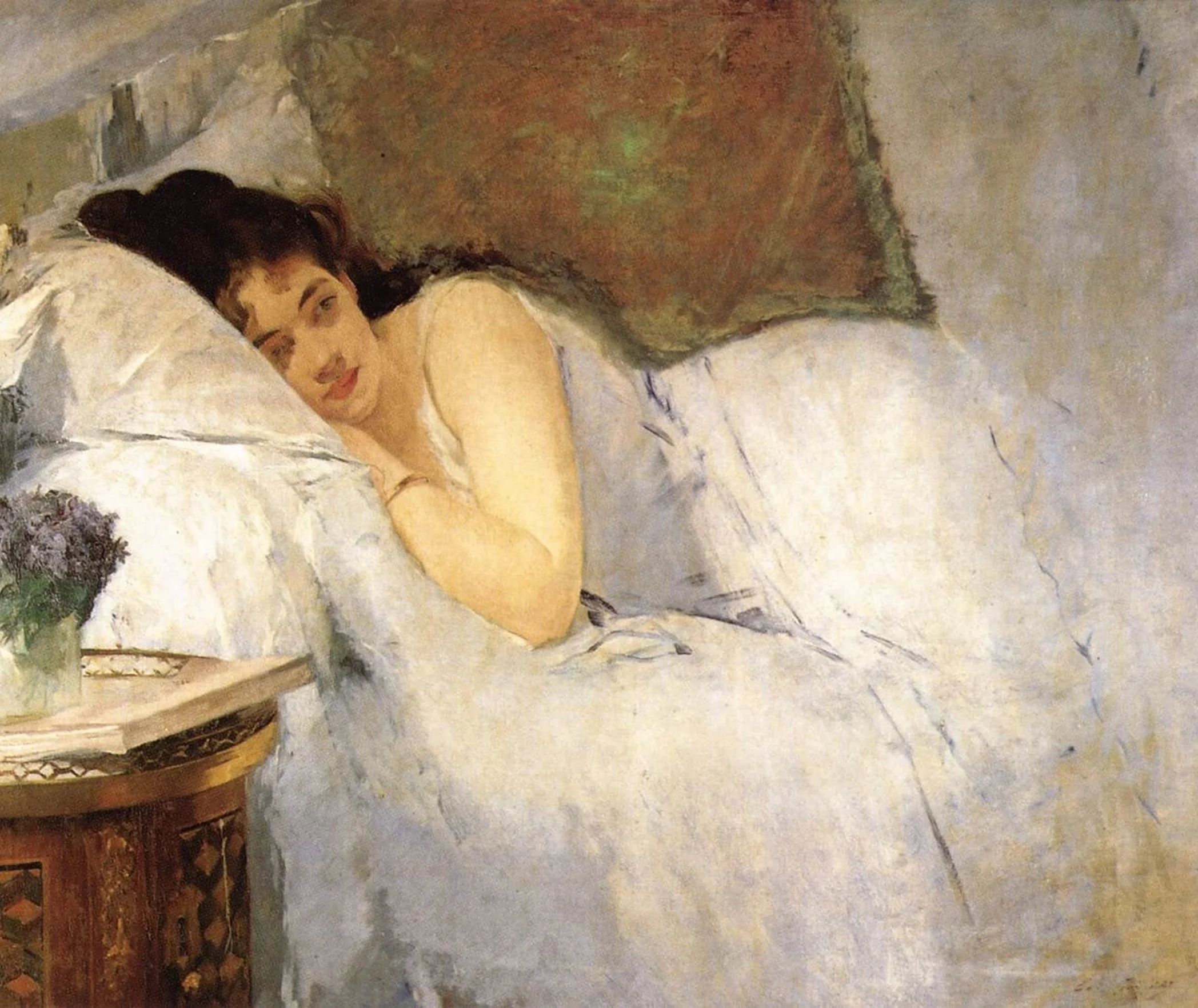
In later works like Jeune fille au réveil, she turned to intimate, everyday moments of women’s lives, painted in soft whites and pale light.
Test your eye
Now try the same questions on three original works available on NALA today. Look first, decide which one you would hang, then read on to see who made each one and what we noticed.
Keep scrolling for the names.
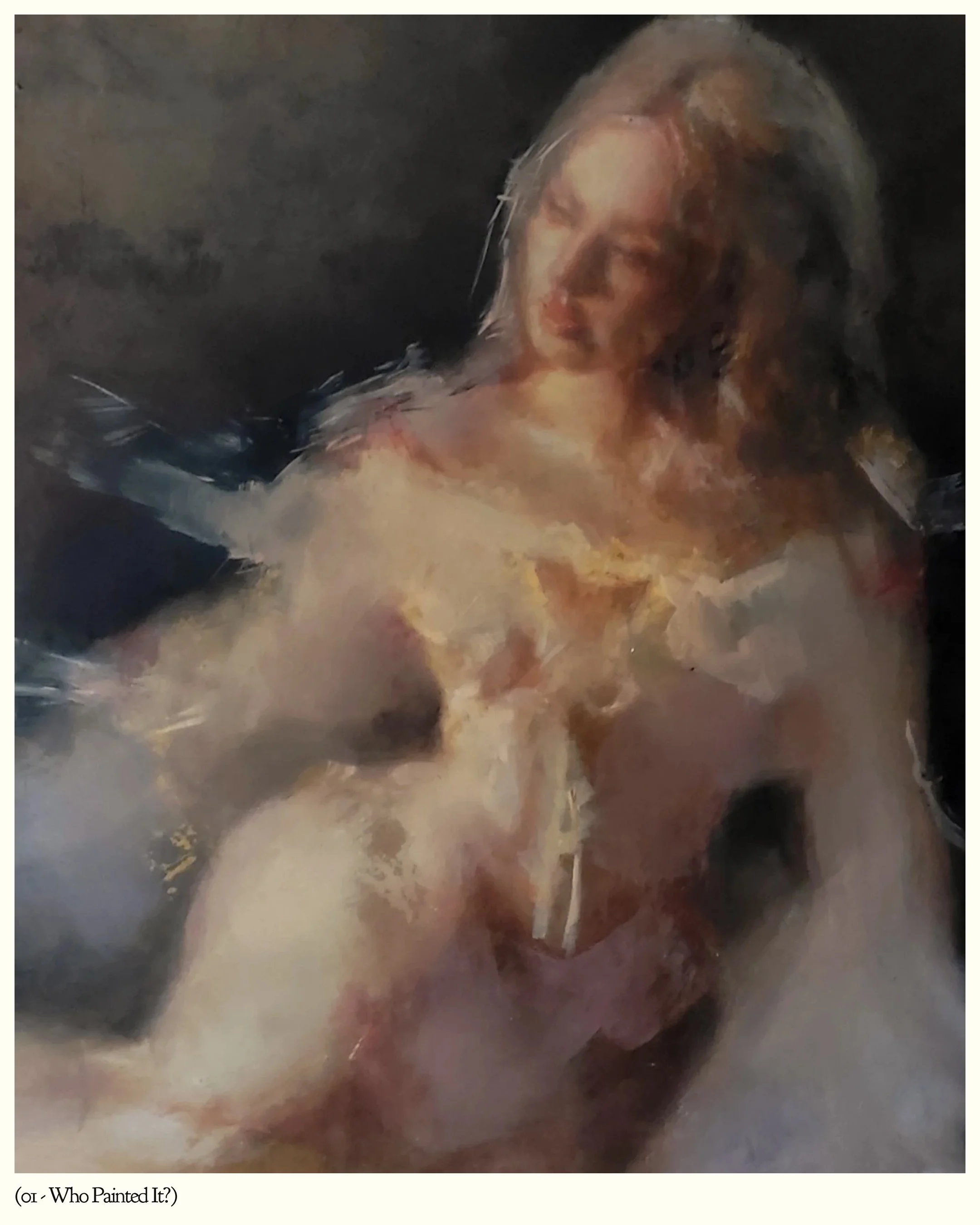
A: (Brilliant Trace, 2026) By Yulia Kyrsanova $850
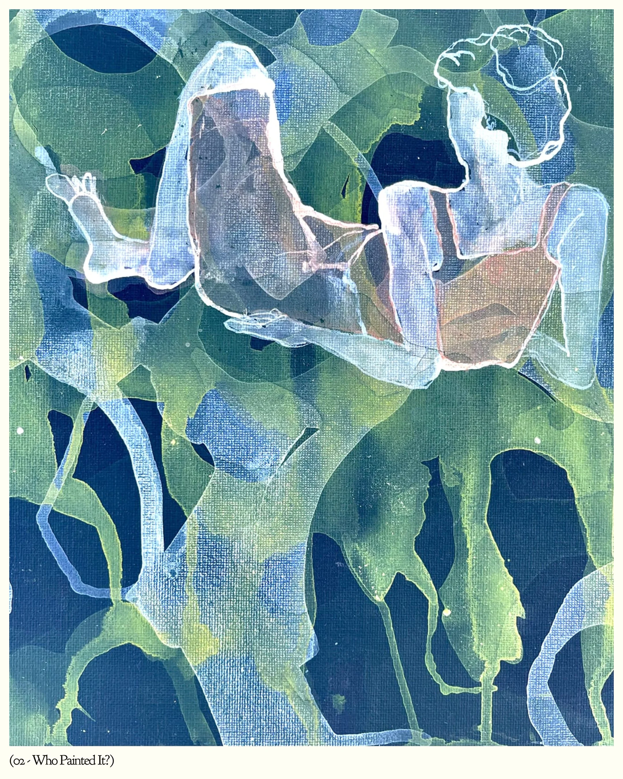
B: (Jeux D’ombre Regardant ses Orteils, 2025) By Skadi Engeln $1,400
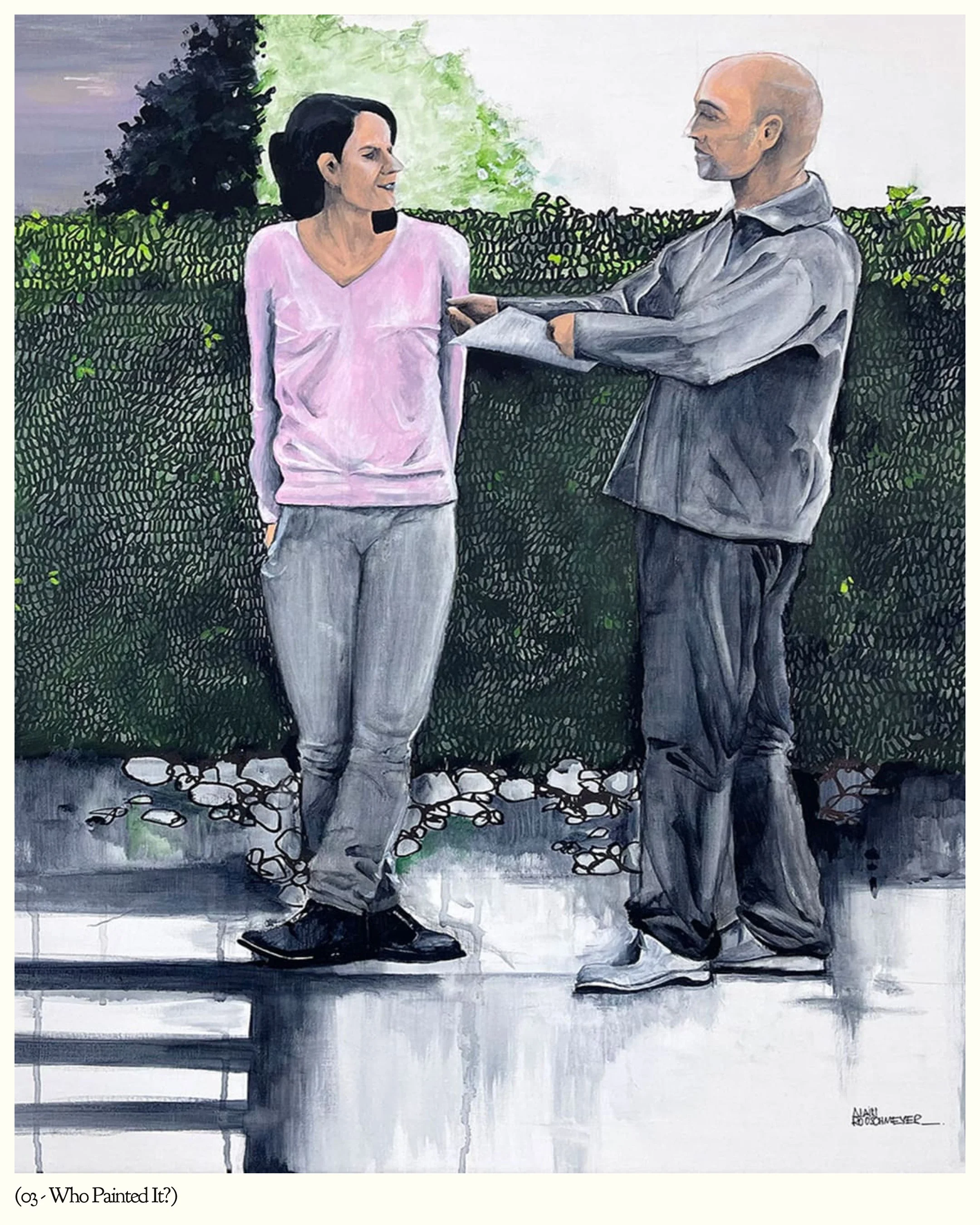
C: (Agathe & Julien 2024, 2025) By Alain Rouschmeyer $2,790
Three artists, three very different ways of seeing the world. Perhaps one drew you in immediately, while another became more interesting the longer you looked. There is no correct choice. Discovering art is as much about developing your own eye as it is about learning the names behind the work. And sometimes, the painting that stays with you is by an artist you’ve only just discovered.
A. Brilliant Trace byYuliia Kyrsanova
What draws your attention first? The softly illuminated figure emerges from a dark, atmospheric background, with light catching the pale fabric and loosely defined features. The contrast gives the painting its immediate presence, but it’s the handling of the paint that encourages a closer look. Forms seem to dissolve at their edges, leaving parts of the figure suggested rather than fully described. The result is a portrait that feels less like a fixed likeness and more like a fleeting impression or memory.
B. Jeux d’Ombre Regardant ses Orteils by Skadi Engeln
Here, colour and composition work differently. Layers of blue, green and pale translucent forms create a space that feels fluid rather than fixed. Figurative elements emerge from the overlapping shapes, but they don’t immediately settle into a single, obvious reading. Your eye moves between the figures, the surrounding colour and the spaces in between. It’s a useful reminder that a painting doesn’t need conventional realism or a clear focal point to hold our attention. Sometimes the pleasure comes from discovering how its different elements relate to one another.
C. Agathe & Julien by Alain Rouschmeyer
Two figures stand together in an ordinary outdoor setting, yet the relationship between them makes the scene intriguing. Their contrasting postures, the distance between their bodies and the suggestion of an exchange create a narrative without fully explaining it. The relatively restrained setting allows these small gestures to carry much of the painting’s emotional weight. We begin to wonder who these people are, what has just happened and what might happen next. It’s an example of how a familiar scene can invite sustained attention through the smallest details.
Frequently asked questions:
Does it matter if I have never heard of the artist?
Not for whether the painting is good. Many artists now in museums were overlooked for most of their careers. Carmen Herrera sold her first painting at 89, and Eva Gonzalès waited more than 140 years after her death for her first major retrospective.
Should I buy art as an investment?
Buy art because you want to live with it. Prices for emerging artists can rise, fall or stay the same, and nobody can promise which. A painting you love earns its place on your wall whatever happens to its price.
How much does an original painting cost?
Often less than people expect. Original works by living artists can cost a few hundred dollars, and buying direct from the artist’s studio removes the gallery markup.